Lock and Key
Chemistry introduced the metaphor of lock and key to explain how enzymes got cozy with other chemicals, bringing them together to facilitate chemical reactions. That cozy fit, a combination of matter and energy, was described as a lock opened by an enzymatic key. That was a wholly accurate metaphorical way of describing the interaction between simple molecules, and it was adopted by biological science to explain a range of cellular behaviors, including the replication of our DNA. Unfortunately, it has proven to be a flawed metaphor, especially concerning our immune system where, at best, a key can often jimmy the lock.
The new study looks at our immune response to COVID and several of its variants of concern, as well as the prior Moderna vaccine. It uses a visualization technique called antigenic cartography to describe what portions of the COVID virion are being responded to by our immune system. As it turns out, each of us reacts to differing components of the virion. We can use statistical means of identifying the virion components most of us respond to; the researchers expressed those statistical relationships visually as maps. The closer the areas were, the more likely one of our immunologic keys could jimmy the entire area and afford us protection.
To arrive at their conclusions, the researchers used 207 samples of patients serum (the portion of the blood without cells that contain our antibodies) who had either been
- infected with one of the COVID variants
- never infected with COVID
- received the first two injections of the Moderna vaccine
The ability of the sera to “neutralize” COVID was based on the titration of the patient’s sera against an established set of COVID variants. Every profile was different, but there were statistical similarities, what we describe as cross-reactivity between variants, allowing the sera to act against more than one variant – there was no single variant (lock) opened by the sera (key), the sera could respond (jimmy) several variants. They also found a broader response in the sera of those previously infected compared with those vaccinated – consistent with our observations. They noted that the Omicron variant seemed to have far less cross-reactivity with other variants, again in keeping with our observation that our initial vaccines were not as effective against Omicron.
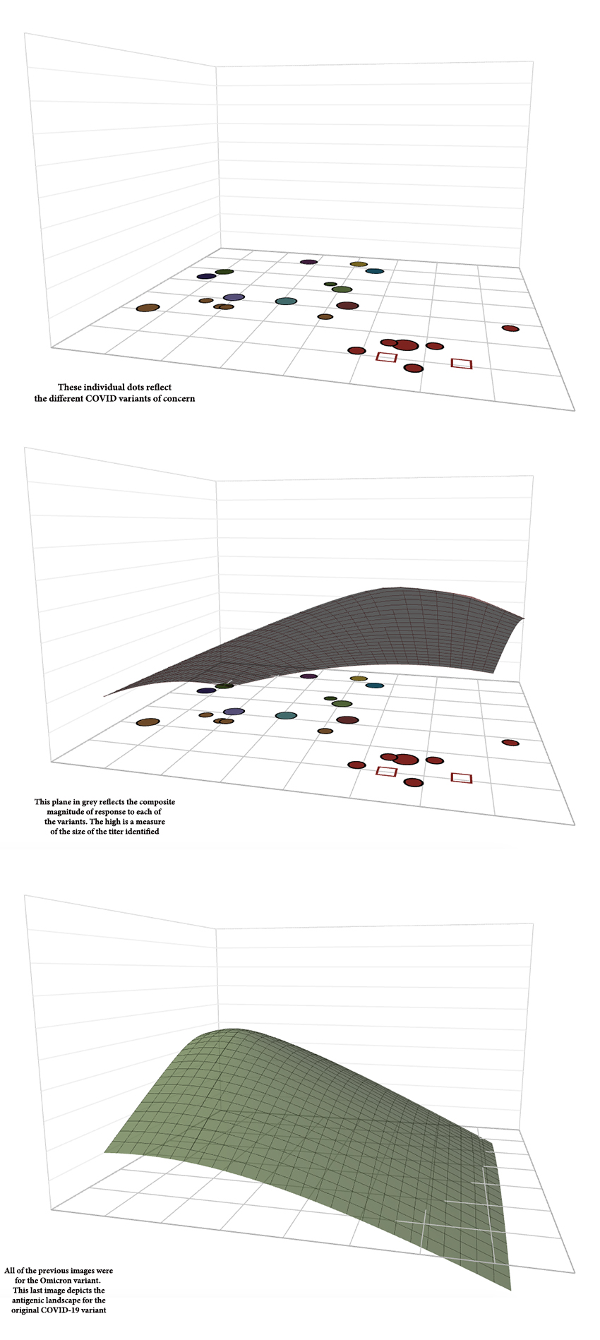
These cross-reactivities reflect “shared” phenotypes, the portion of the virion identified as “foreign.” Here is an image of one of the maps; you can find an interesting interactive version on the web.
 There is a lot going on in this illustration. The topmost image's dots and squares shows COVID's variants of concern, from the original all the way to Omicron.
The middle image depicts the immune response to Omicron. The height of the plane over the dots and squares is a measure of the strength of reactivity in the immune response - higher is more robust. It is greatest, as to be expected, over the dots and squares representing the Omicron variant. But note, it isn't flat elsewhere; there are other areas of highs and lows that reflect the strength of our immune response to each of COVID's variants. Our immunologic response reflects all of our exposures, not just to one variant.
The key to the study lies in the comparison of the middle and bottom-most images. final two images. The middle image depicts the serologic response to the Omicron variant; the bottom image is the same representation but of the original COVID variant that began the pandemic. It is now quite easy to see how our immune responses to these variants are quite different.
Those differences explain why exposure to older versions of COVID may not provide as much protection against newer variants; and it doesn't matter whether that exposure was from infection or vaccination. Our immune system has a memory of all that we were exposed to previously. The landscape of our individual response reflects that memory. This immunologic landscape also goes a long way in explaining the varying efficacy of vaccination with respect to specific populations of people or viruses.
“It was a surprise how much of a difference we saw in the focus of immune responses of different people to SARS-CoV-2. Their immune responses appear to target different specific regions of the virus, depending on which variant their body had encountered first. Our results mean that if the virus mutates in a specific region, some people’s immune system will not recognize the virus as well - so it could make them ill, while others may still have good protection against it.”
- Dr Samuel Wilks, University of Cambridge’s Centre for Pathogen Evolution
This brings me back to metaphor. Lock and key doesn’t do much to explain the vast differences between those two landscapes. And I have not bothered to layer in the range of differing landscapes each of our immune systems provides. Even the use of jimmying the lock fails, at least for me. Perhaps it is better to look to the 19th century and Marley’s ghost from A Christmas Carol. Upon visiting Scrooge, he is seen having chains “made of cash boxes, keys, padlocks, ledgers, deeds … chains (he) forged in life.” Our serologic response to infections is forged in life from our prior exposures. That is why we each have a unique reaction to infections or vaccines. This is why it is challenging to create a seasonal influenza vaccine.
I have written on this topic before, drawn in by another wonderful metaphoric term, original antigenic sin. The study that invoked those words looked at our response to influenza, another of the respiratory viruses. This current study extends the findings to COVID.
Source: Mapping SARS-CoV-2 antigenic relationships and serological responses Science DOI: 10.1126/science.adj0070


